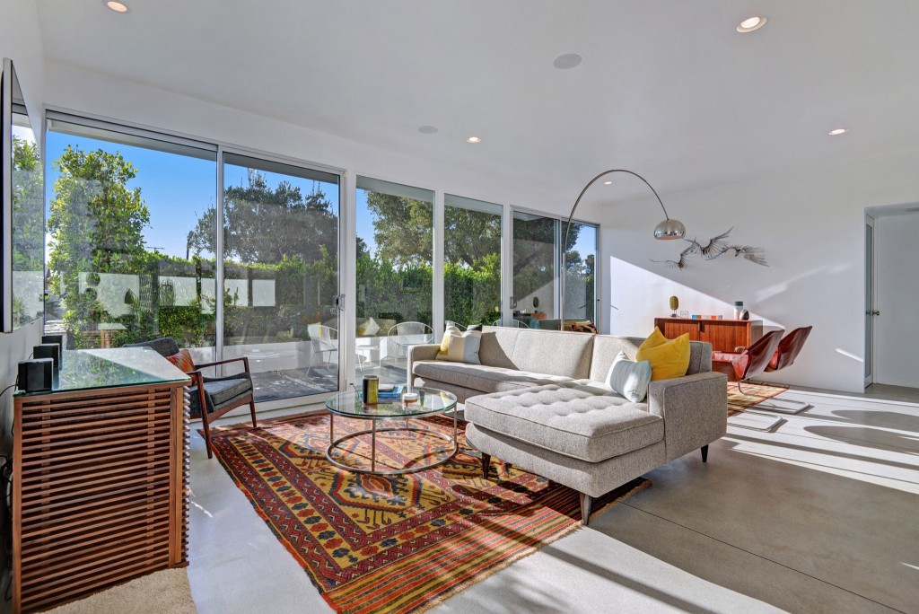
Chris Pardo (no relation to this post’s author) specializes in urban environments and iconic buildings. When he was placed in charge of perfecting the look of an L.A.-based Wexler steel house, Chris and his firm, Chris Pardo Design: Elemental Architecture, worked closely with the homeowners to improve the entryway (part 1). Faced with clean lines and large, spanning spaces, the home proved a unique challenge, taking about a year to gut and renovate the interior. But for now, it was on to the living room remodel.
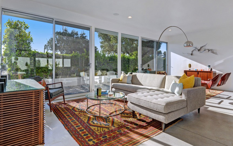
Chris and the homeowners’ advice for long rooms like the Wexler’s living room is to think it through and plan accordingly. Proper space planning is important to make the room look friendly and inviting.
They all decided to leave the space completely open, creating two unique spaces that complemented each while maintaining separate identities. Of course, lounging would be possible no matter where you sat!
For amateur decorators and homeowners looking for the midcentury modern look in your living room remodel, Chris suggests a two-step approach. First, be thoughtful of the interiors—let the shapes and spaces speak for themselves, such as the Wexler’s living room and the entryway did.
Second, make sure the lines you’re using are clean and simple. Although each section of the living room has a brightly colored area rug, these colors play well against the neutral palette and aren’t bombastic, especially paired with the subtle colors of the couch cushions and chairs.
With the wondrous Wexler’s living room remodel finally polished up with proper space planning and ultra fab furnishings, the last big hurdle was the kitchen. How did Chris and the homeowners keep it classic midcentury modern without crowding out the homeowners? Keep an eye out for part 3!

