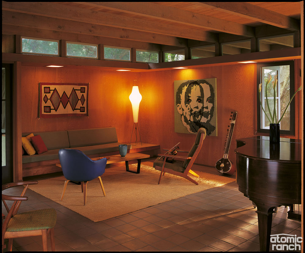
Architect Tim Andersen did not want to exclude the sycamore tree on the Apostols’ property when planning the addition of their new living room. But instead of listening to an architect authority’s advice, he went with his design gut and decided to literally incorporate the tree into the living room. This only made it easier to fulfill the original homeowners’ wish (part 1), which was for their new living room to open into the garden.
“There was a beautiful sycamore tree with three trunks that I pulled into our scheme by making a notch in the building for the tree and allowing it to ‘anchor’ the house to the landscape, something Richard Neutra often recommended,” Andersen explains. “In 1975, I was still persuaded by the Secretary of the Interior Standards for Historic Preservation, which advocated new additions be designed as ‘complementary,’ but distinct from the original building.
“I no longer believe this separate-but-equal strategy is desirable. Modern additions to historic buildings often appear as if they had been designed by only the most unobservant, insensitive and egocentric of architects—precisely because they adhered to the Secretary’s standards. Since the 1980s, my additions have attempted to be seamless with the original building, as if they have always been there. Everyone except the architectural historians has been grateful.”
Some 20 years after Andersen’s addition, the Maunu family brought in Fung+Blatt to convert a small stable into a pool house with an attached shade structure, and to remodel their master bath into a modern interpretation of a sauna. The team used recycled materials—glass, corrugated steel and redwood—for the pool house project, and created a new bath at the back of the structure that is virtually a greenhouse.
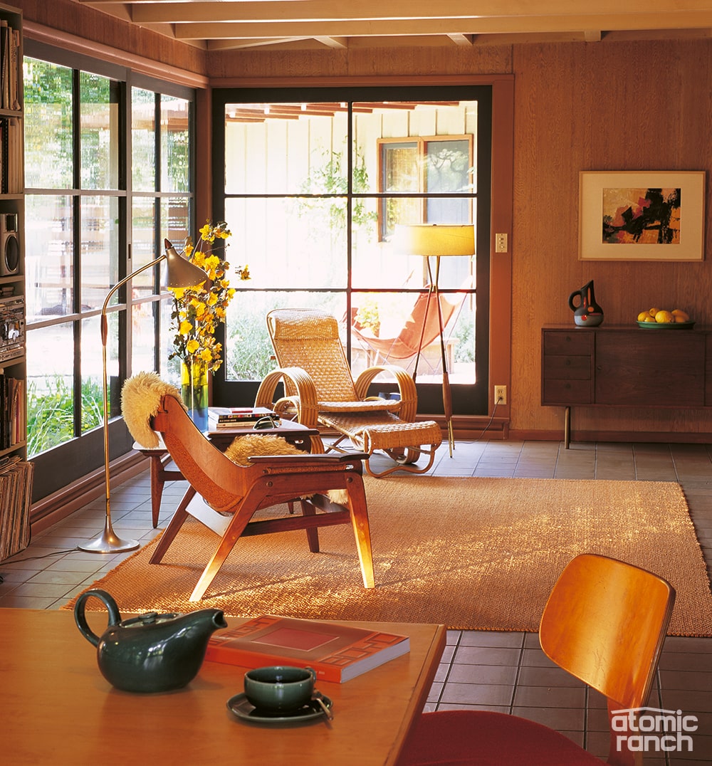
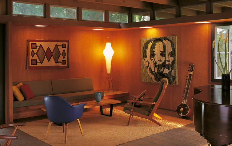
Peter has had his own hand in shaping the ranch house. He designed the trellis near the front door based on the grid of the existing windows, constructed a privacy screen off the driveway and added a decorative overhang at rafter-tail height. Inside he built in two sofas and designed the couple’s bed and dresser, as well as a family dining table that’s surrounded by flea market Thonet chairs he reupholstered.
“I like the idea of building furniture into this kind of woodsy, modern house—they’re really the next generation of Craftsman bungalows,” Peter says. He researched the built-in sofas that Frank Lloyd Wright did in his Usonian houses as well as Schindler’s built-ins and came away with some applicable ideas.
“In the evolution of Wright’s houses to his Usonian model—one story, flat-roofed houses—there are aspects that feel like a Craftsman—cozy nooks, built-ins, very warm. Anyone who thinks that modern architecture isn’t warm should look at the interior of a Usonian house; they’re as cozy as any log cabin. The feeling of this house reminded me of them a little bit,” he says.
Tim Andersen Sets the Stage
The Maunu family did not pay too much attention to names when furnishing their remodeled home. Find out why they did not opt for a more “iconic” collection in Part 3.

